New Dracula site and logo
The Dracula site and logo were the same since 2013. I’ve always wanted to give it a refresh, but I was never able to prioritize it. Now that Dracula Pro exists, I have some funding to invest and the energy to keep improving the open source version even more 😁
§New site
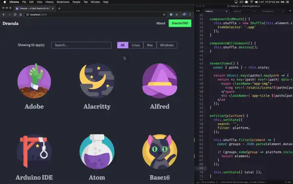
Now that we have 92 different themes, I decided to focus on discoverability. The new search finds themes by name and synonyms. The new filter helps you see only what matters to you. The animations also make the experience more enjoyable.

I love Static Site Generators (SSG) since the day I became a web developer. The Dracula site had a long journey, and I feel like now we have a great stack.
- 2013: Created the site using Jekyll
- 2016: Migrated from Jekyll to Metalsmith
- 2020: Migrated from Metalsmith to Next.js
§New logo
Like JavaScript frameworks, design trends come and go. When I first started Dracula, Skeuomorphism was the coolest thing ever, and now it feels outdated. Besides that, the icon library I used was very limited, and I had to re-use the same icons for different themes.

This new Detailed Circular Flat style has a modern, simple, clean look. I’m still getting used to the change, but I love the consistency it brings to the entire experience.